Resources
Klaviyo's Benchmarks Tool Compares You to Peers Who May Be Stuck in Promotions Too. The Average Includes the Problem
Author :
MailMend Team

Klaviyo's benchmarks show how your open rate, click rate and revenue per recipient compare with similar brands. They're genuinely useful. The catch is that your peer group includes plenty of accounts losing part of every send to Promotions, so matching the average doesn't prove your placement is healthy. It may just mean your peers share the same ceiling.
Key takeaways
Klaviyo campaign revenue benchmarks compare you with brands in your industry and size band, and that group includes many accounts with placement problems they don't know about.
Looking "average" can mean you're fine, or that your peers are struggling the same way you are.
The benchmark is still worth using. It just answers a different question from the one most brands ask it.
To know whether placement is holding revenue back, test placement directly.
Klaviyo's benchmarks feature puts your numbers next to a peer group: open rate, click rate, conversion rate, revenue per recipient, broken out by industry and company size. Most brands have no other easy way to see whether their numbers are normal for their vertical, so it fills a real gap.
Here's the problem. Klaviyo campaign revenue benchmarks are built from thousands of accounts sending real campaigns, and a meaningful share of those accounts land a portion of their mail in Promotions. That ceiling is already baked into the average you're measured against.
What Klaviyo campaign revenue benchmarks actually measure
The benchmarks are calculated from what happened after sending: deliveries, opens, clicks, orders. That's real behavior, which is why the tool is good for spotting trends in your own account.
It says nothing about where emails landed before any of that happened. A brand sitting at the industry average could be getting strong Primary placement. It could also be getting most of its revenue from a smaller, loyal group who check Promotions, while a big part of the list never sees the email. Both can produce similar numbers against the same benchmarks, and the benchmark can't tell you which one you are.
Why "average" can be false comfort
Two brands in the same vertical both sit right on the benchmark for click rate. One has clean Primary placement and an engaged list. The other has half its sends filtered into Promotions, and its clicks come mostly from the subscribers who still check that tab. Against the benchmark they look identical. Only one has a placement problem.
That's the trap. A brand checks its dashboard, sees it's tracking with its industry, and decides there's nothing to fix, while a real chunk of revenue sits with subscribers who never saw the email in a place they check.
One more wrinkle: open rates in any benchmark are inflated by Apple Mail Privacy Protection, for you and your peers. Lean on click rate and revenue per recipient when you compare.
Why steady senders fall into this most
A brand with consistent weekly volume has plenty of data, so the comparison against Klaviyo campaign revenue benchmarks feels solid. That reliability is what makes it easy to stop questioning the number. If you track close to the industry month after month, it's natural to treat deliverability as settled and move on to subject lines and send times.
That's the right move if placement really is clean. It's the wrong one if placement is quietly capping the number you're comparing.
What actually answers the placement question
The benchmarks are good at two things, so use them for those: tracking your own trend and sanity-checking against your vertical. They can't tell you whether your Primary versus Promotions split is helping or hurting, because placement isn't one of the inputs.
To answer that you need to look at placement directly:
Seed tests across Gmail, Yahoo and Outlook show where a message lands in test inboxes. Useful, but those inboxes have no history with you.
An on/off A/B test on your real list shows whether changing placement changes clicks and revenue for your actual subscribers.

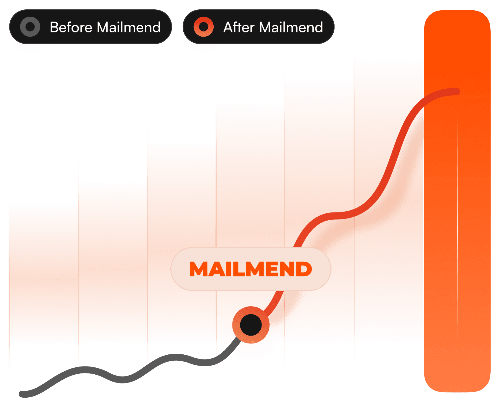
MailMend's before-and-after graphic. Benchmarks measure outcomes after delivery; placement shapes them first.
See where your emails are actually landing
If you're tracking with Klaviyo campaign revenue benchmarks and still want to know whether placement is capping you, that's a separate check from anything the benchmarks tool does.
MailMend is built for that question. It's made for Klaviyo, designed to improve how often your campaigns and flows land in Primary rather than Promotions, and needs no changes to your copy, your list or your sending strategy. Run it as a native Klaviyo A/B test, MailMend on versus off, and read the difference in clicks and revenue per recipient, the same numbers you'd compare against a benchmark.
Book a demo to see it on your account. The free trial starts after your first A/B test.
Frequently asked questions
Are Klaviyo campaign revenue benchmarks still worth checking?
Yes, for tracking your own trend and getting a sense of where your vertical sits. Just don't treat "average" as proof that placement isn't an issue.
Can two brands with identical benchmark numbers have different placement?
Yes. The benchmark only measures what happened after delivery, so strong Primary placement and heavy Promotions placement can produce similar numbers for different reasons.
How do I check placement separately from the benchmarks tool?
Seed test across Gmail, Yahoo and Outlook, and run an on/off A/B test on your own list to see the effect on clicks and revenue.
If I'm below the benchmark, is it always placement?
No. It could be placement, list quality, content, offers or timing. Testing placement directly is the only way to rule it in or out.